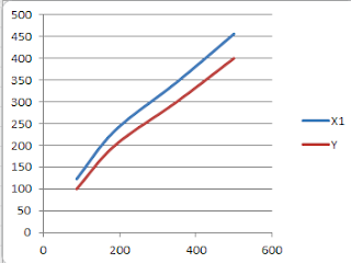
To plot a graph in Microsoft Excel 2010 by taking the column data as axis in the graph:
1.Highlight the column data that you wish to plot.
2.Insert-> scatter graph
If you wish to plot a chart of X1 and X2 against Y
X2 X1 Y
88 123 100
188 234 200
350 345 300
500 456 400
Select these columns, goto insert and then click scatter chart. This will give the following chart:

But this is not what we want. Now plot X2 and Y , then plot X1 and Y. Then copy the curve from a plot and paste the curve to another plot.

If you wish to edit the style of the plot. For e.g. changing the thickness of the graph line:
1. Right click on the graph -> format data series -> line style -> width (you can specify the thickness value here)
If you wish to scale the range of x-axis and y-axis data values:
1. Double click on th ex-axis -> axis options -> set the minimum/maximum values ( you can also change other values as you need)
If you wish to label some data points:
1. Double click on the curve -> add data label at specific points
If you wish to provide label for the x-axis and y-axis:
1. click on the graph -> Layout -> AxisTitle -> Primary Horizontal/Vertical Axis Title -> write your title
2.similar process for giving chart name as well.
1.Highlight the column data that you wish to plot.
2.Insert-> scatter graph
If you wish to plot a chart of X1 and X2 against Y
X2 X1 Y
88 123 100
188 234 200
350 345 300
500 456 400
Select these columns, goto insert and then click scatter chart. This will give the following chart:

But this is not what we want. Now plot X2 and Y , then plot X1 and Y. Then copy the curve from a plot and paste the curve to another plot.

If you wish to edit the style of the plot. For e.g. changing the thickness of the graph line:
1. Right click on the graph -> format data series -> line style -> width (you can specify the thickness value here)
If you wish to scale the range of x-axis and y-axis data values:
1. Double click on th ex-axis -> axis options -> set the minimum/maximum values ( you can also change other values as you need)
If you wish to label some data points:
1. Double click on the curve -> add data label at specific points
If you wish to provide label for the x-axis and y-axis:
1. click on the graph -> Layout -> AxisTitle -> Primary Horizontal/Vertical Axis Title -> write your title
2.similar process for giving chart name as well.
Comments